

Understanding the Difference Between Saturation and Vibrance in Adobe Lightroom
Adobe Lightroom is a powerful tool that photographers and editors use to enhance and manipulate their photos. Among the many adjustments available, saturation and vibrance are two key settings that can significantly impact the appearance of your images. While they may seem similar, they serve distinct purposes in the editing process. In this blog post, we will delve into the differences between saturation and vibrance in Adobe Lightroom and when to use each one effectively.

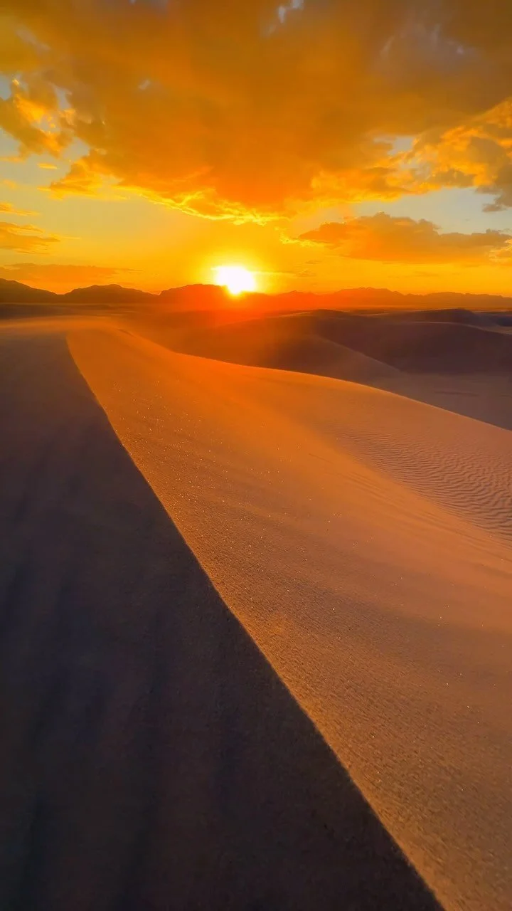
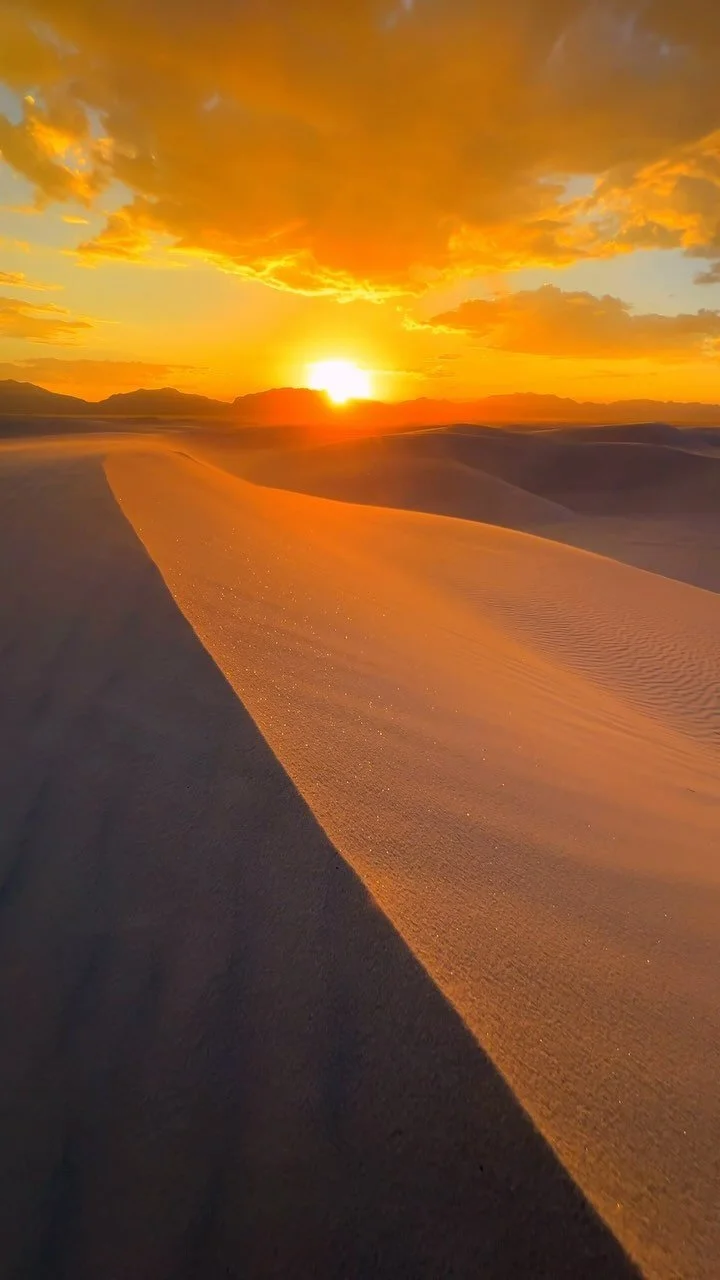
Image By: Dan Costa
Pro-Tip: Lightroom Mobile is a free application that you can download TODAY on your phone. Use it to enhance your photo editing knowledge and capabilities. Really make your photos stand out with this powerful app!
Saturation: Intensity of Colors
Saturation is a fundamental adjustment that controls the intensity or purity of colors in an image. When you increase the saturation of a photo, you're essentially boosting the vibrancy of all the colors within it, making them more vivid and pronounced. Conversely, decreasing saturation desaturates the image, resulting in a grayscale or black and white effect over time.
When to Use Saturation:
Boosting Color Intensity: Saturation is a handy tool when you want to make colors in your image more vibrant and eye-catching. This is particularly useful for landscapes, fashion photography, and any situation where vivid colors are essential.
Creative Effects: Reducing saturation can create a vintage or nostalgic look, adding a unique atmosphere to your photos. It's also a helpful technique for selectively emphasizing specific colors by desaturating the rest.
Artistic Expression: Saturation can be used to create bold and dramatic images that evoke strong emotions or tell a story through color intensity.
Vibrance: A Balanced Approach
Vibrance is a more nuanced adjustment designed to preserve skin tones and avoid oversaturating already intense colors. Unlike saturation, vibrance targets the least saturated colors in an image and enhances them more than the already vibrant ones. This makes it an excellent tool for achieving a natural and balanced look, especially when dealing with portraits or scenes with varying colors.
When to Use Vibrance:
Portrait Retouching: Vibrance is perfect for portraits as it prevents skin tones from becoming oversaturated while subtly enhancing other colors in the image.
Landscape Photography: It helps maintain the realism of a landscape by enhancing less saturated areas such as the sky or distant foliage without overemphasizing already vibrant elements.
Group Photos: When dealing with group photos, using vibrance ensures that everyone's skin tones remain natural, while still enhancing the overall vibrancy of the image.
Combining Saturation and Vibrance
In many cases, using both saturation and vibrance together can yield the best results. Start with vibrance to bring out the subtleties in your image, and then use saturation sparingly to boost specific colors or elements that need extra pop. This approach allows you to maintain a balanced and natural look while making selective color enhancements.
Conclusion
Understanding the difference between saturation and vibrance in Adobe Lightroom is essential for effective photo editing. Saturation is all about intensifying colors across the board, while vibrance offers a more controlled and balanced approach, particularly suitable for portraits and scenes with diverse color palettes. Knowing when and how to use these adjustments will help you achieve the desired visual impact in your photos and enhance your overall editing skills in Adobe Lightroom. So, experiment with both settings and see how they can transform your images, providing you with more creative control and the ability to express your unique vision.
Want to up your Lightroom skills every week? Tune into the Instagram and YouTube where I post daily tutorials!
How do you use these sliders?
Related Posts
But Wait There’s More
Thanks for hanging out! Hopefully, the read was enjoyable and full of cool tips. Got questions or want to share some thoughts? Drop a comment below. Don’t forget to subscribe to the newsletter for the latest updates and exclusive content. For those seeking a professional travel photographer or creative services, connect and follow on social media to stay inspired and see the latest work.
Keep Creating! 📸
Making Friends World Wide


Looking for the perfect travel tripod? Our top recommendation is ideal for any photographer, offering stability, lightweight design, and ease of use. Enhance your photography with this reliable and versatile tripod, perfect for capturing stunning shots on the go.